
Data Visualization
Breaking News
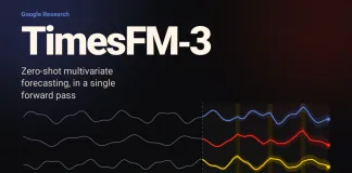
Google AI Releases TimesFM-3: A 330M Parameter Zero-Shot Foundation Model For...
Google Research has released TimesFM-3, a 330 million parameter time series foundation model that forecasts multiple related series in a single forward pass. Unlike every TimesFM checkpoint through 2.5, it is pretrained natively for multivariate forecasting, accepting multiple targets, past covariates, and past-future covariates with no task-specific fine-tuning. It takes the top average rank among pretrained foundation models on GIFT-Eval, fev-bench, and the TIME leaderboard. The weights, however, ship under a non-commercial, non-production license.

Designing Scalable Interactive Visualizations with Reflex XY: Composition, Million-Point Rendering, Streaming,...
Dive into the advanced visualization capabilities of the Reflex XY Python library. This tutorial guides you through building high-performance, interactive charts—from handling million-point datasets and real-time streaming to creating custom mark plugins and exporting publication-ready visuals.
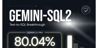
Google Releases Gemini-SQL2: Gemini 3.1 Pro Text-to-SQL Scores 80.04% on BIRD...
We look at Gemini-SQL2, the text-to-SQL capability Google Research announced on June 12, 2026. Powered by Gemini 3.1 Pro, it posted 80.04% execution accuracy on the BIRD single-model leaderboard. We explain what the score measures, how the leaderboard stacks up, and what Google has not yet disclosed. We also cover use cases and a schema-grounded implementation pattern.

A Coding, Data-Driven Guide to Measuring, Visualizing, and Enforcing Cognitive Complexity...
In this tutorial, we build an end-to-end cognitive complexity analysis workflow using complexipy. We start by measuring complexity directly from raw code strings, then...

How to Build Production-Grade Data Validation Pipelines Using Pandera, Typed Schemas,...
Schemas, and Composable DataFrame ContractsIn this tutorial, we demonstrate how to build robust, production-grade data validation pipelines using Pandera with typed DataFrame models. We...

How to Design an Interactive Dash and Plotly Dashboard with Callback...
In this tutorial, we set out to build an advanced interactive dashboard using Dash, Plotly, and Bootstrap. We highlight not only how these tools...

Creating Dashboards Using Vizro MCP: Vizro is an Open-Source Python Toolkit...
Vizro is an open-source Python toolkit by McKinsey that makes it easy to build beautiful, production-ready data visualization apps. With just a few lines...

GWalkR: A One-Stop R Package for Exploratory Data Analysis with Visualization
In the era of information, data analysis is one of the most powerful tools for any business providing them with insights about market trends,...

Best Practices for Data Visualization (2023)
The process of converting data into understandable pictures is known as data visualization. The visual depiction of numerical data using different graphs, charts, and...